curious grace
REBRAND | PACKAGING
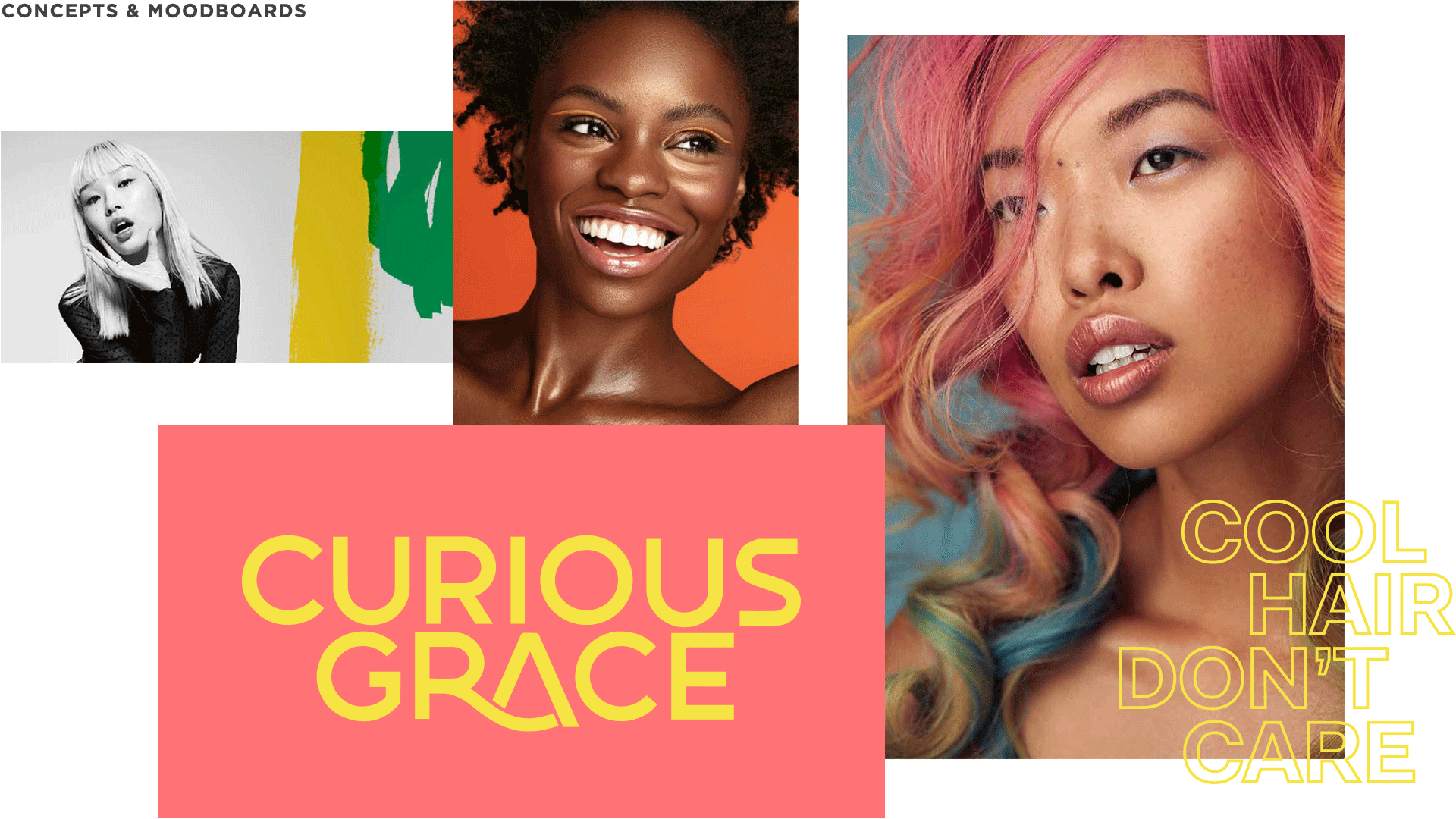
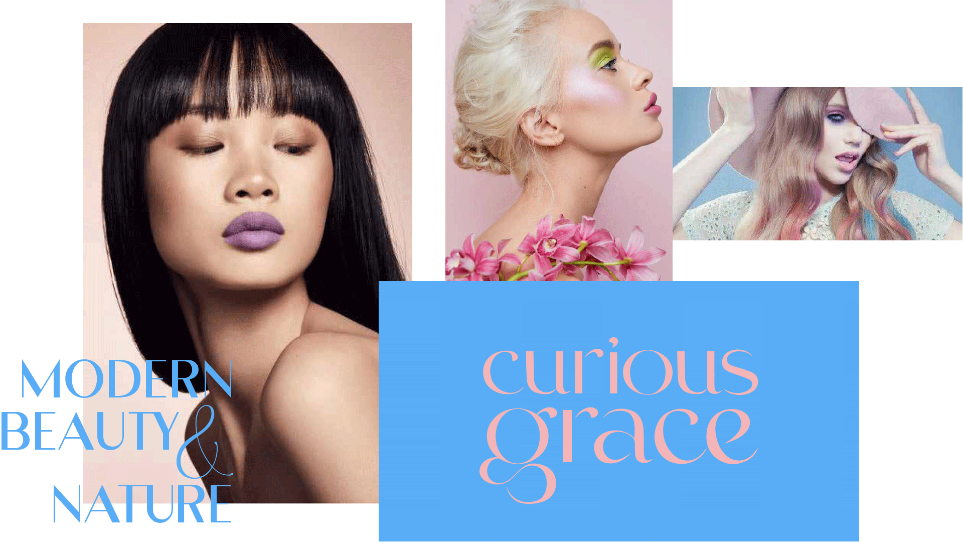
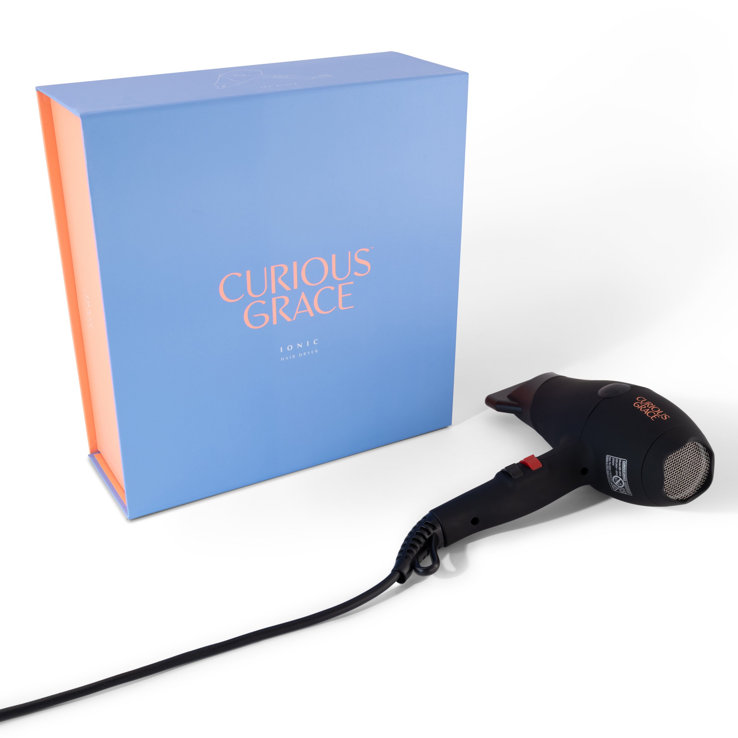
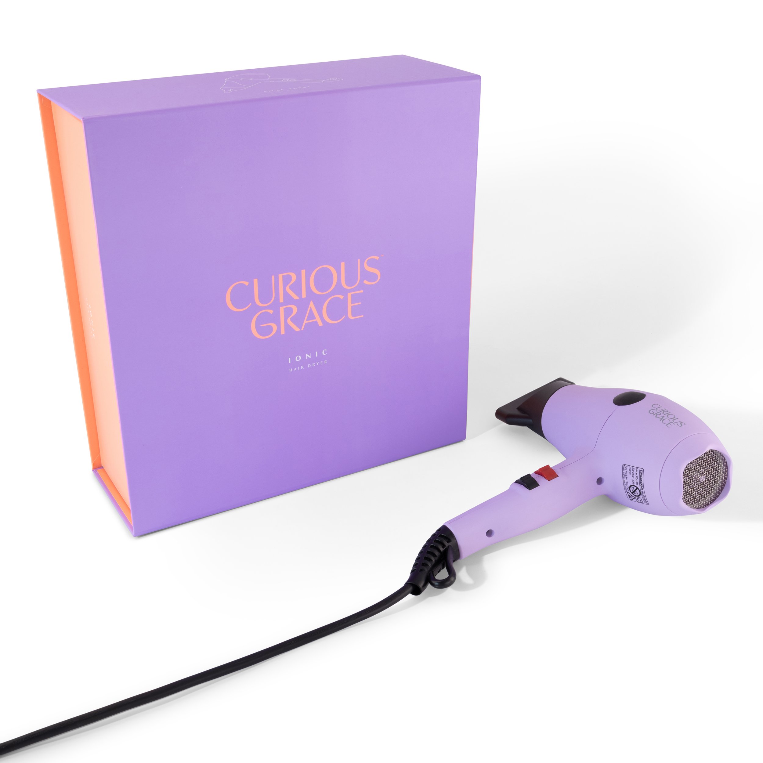
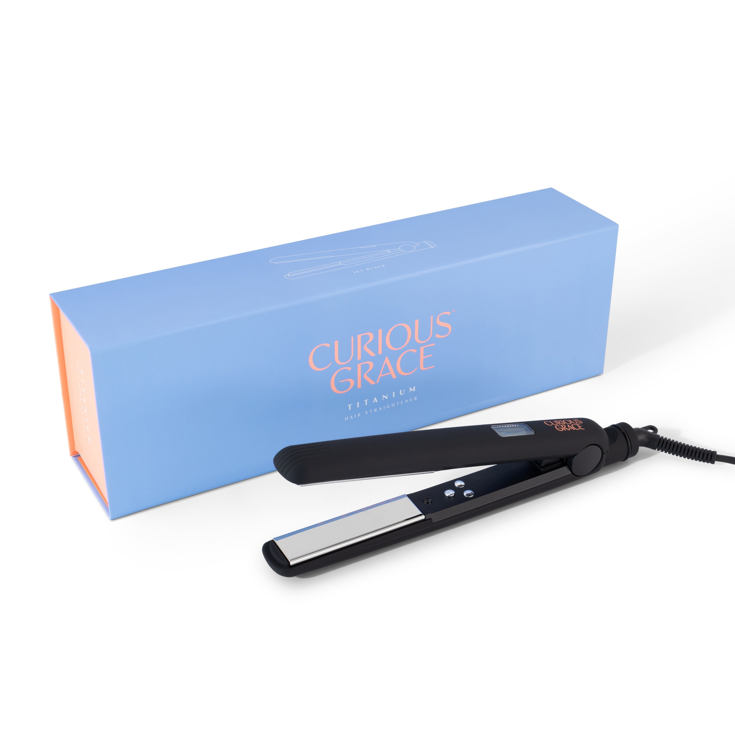
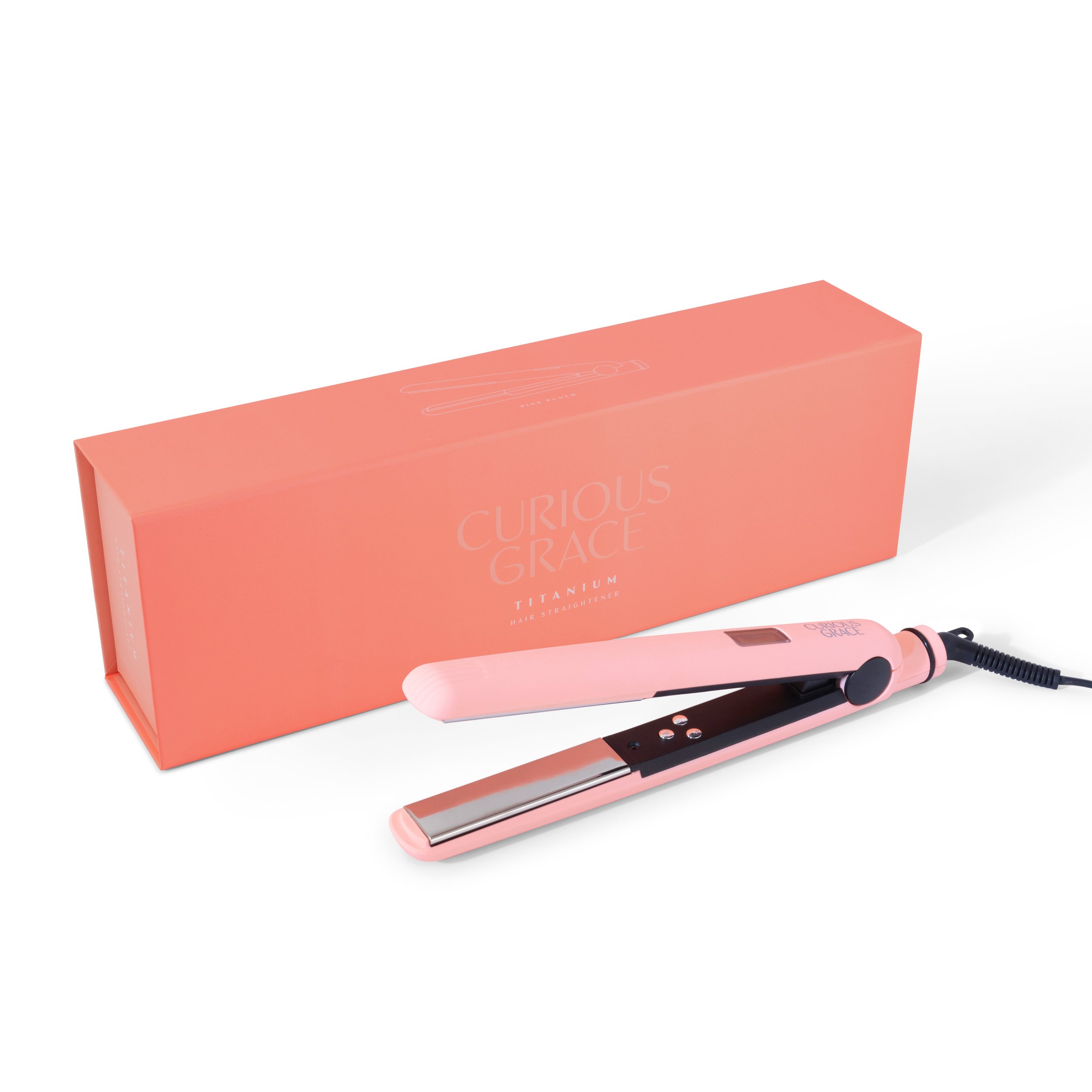
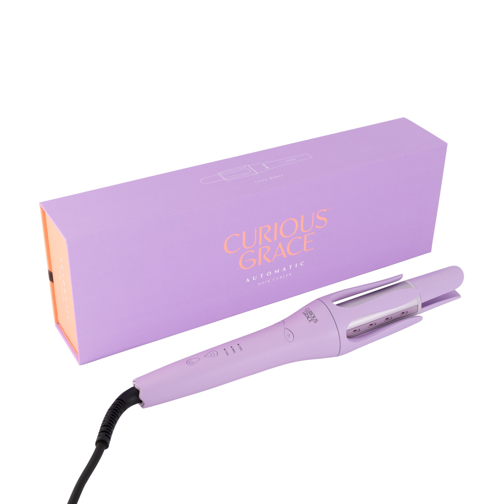
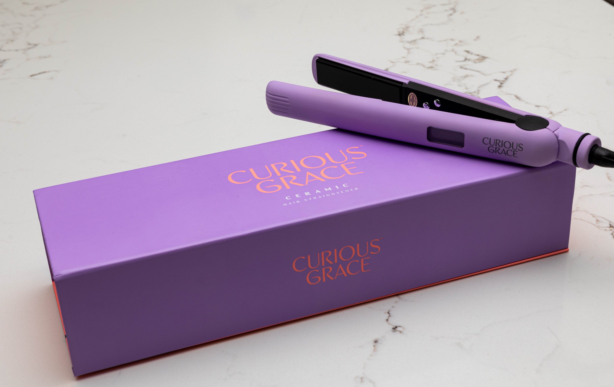
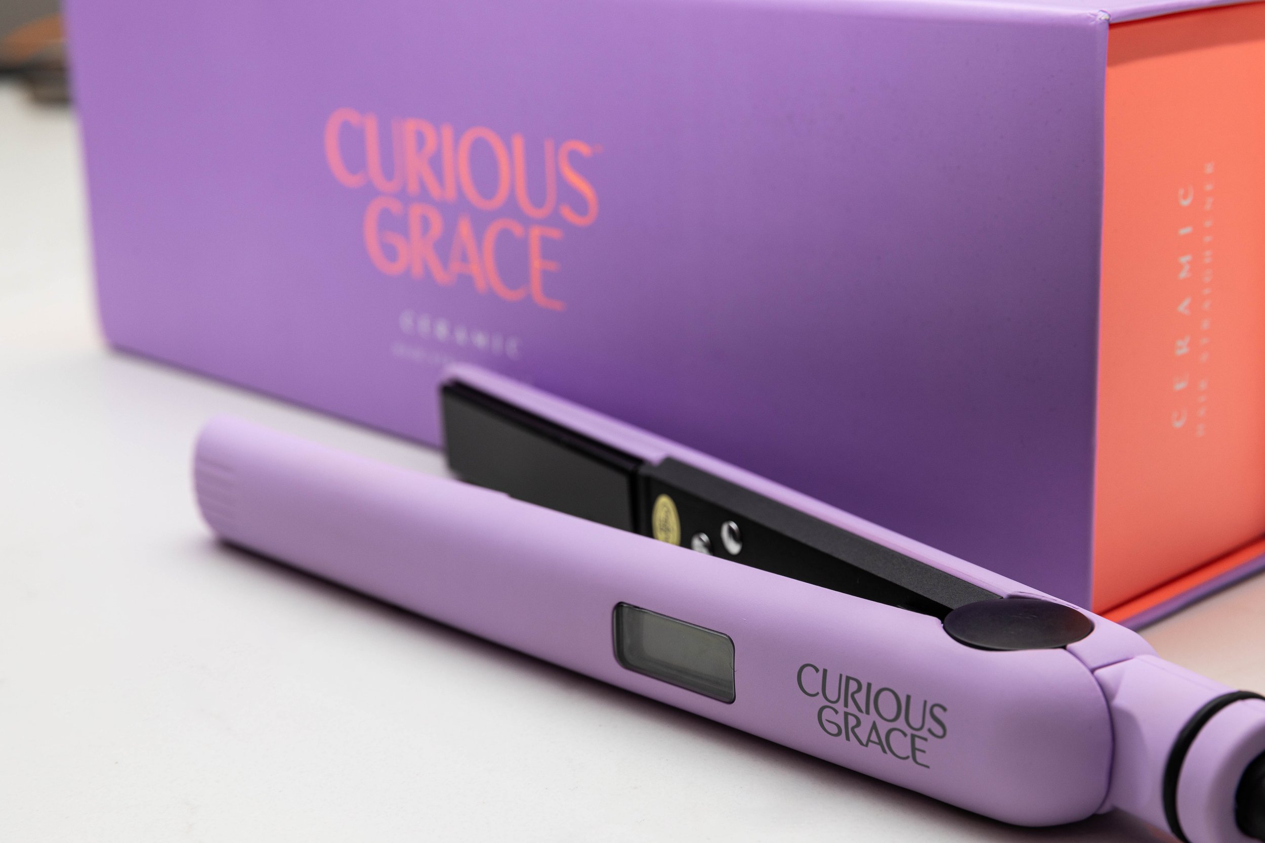
Curious Grace is one of the exclusive electrical lines for Hairhouse targeted at the younger demographic, so I really had some fun with this rebranding project. The logo was updated to a more feminine and smoother logotype, with the “Rs” taking a subtle nod to the movement of hair, while the brand identity and packaging really delved into the use of colours for the vibrancy and spirit of the brand.
The brand relaunch paired with the product photoshoot and the revival of the Instagram profile meant Curious Grace was tastefully brought to life, boosting sales in the previously dipping category.