curious grace
CREATIVE CONCEPTS | ART DIRECTION
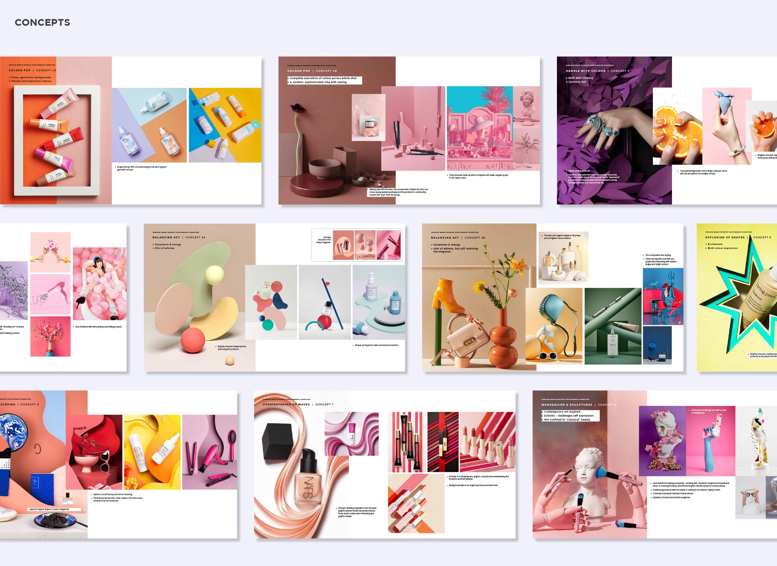
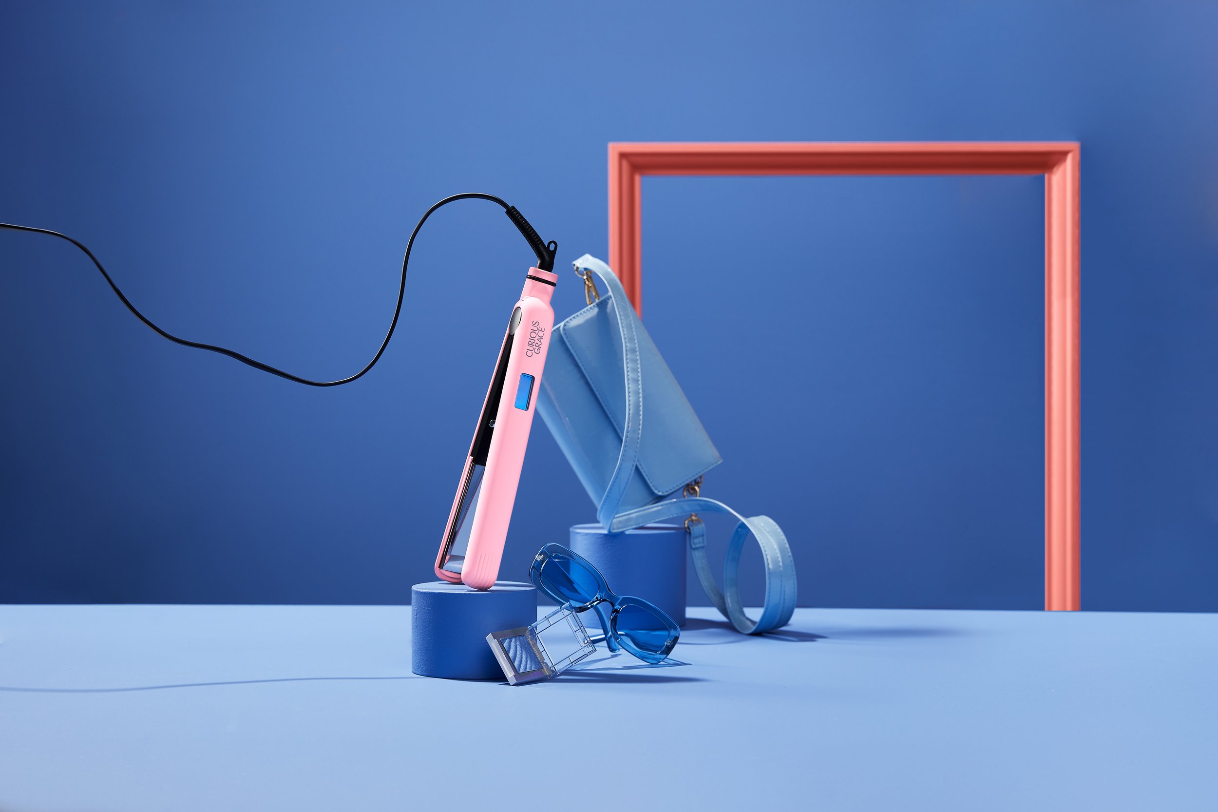
The product shoot for Curious Grace was the main visual element for the major brand relaunch so it needed to make an impact while showcasing the spirit of the brand.
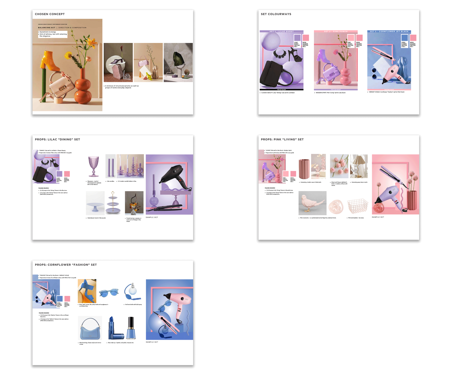
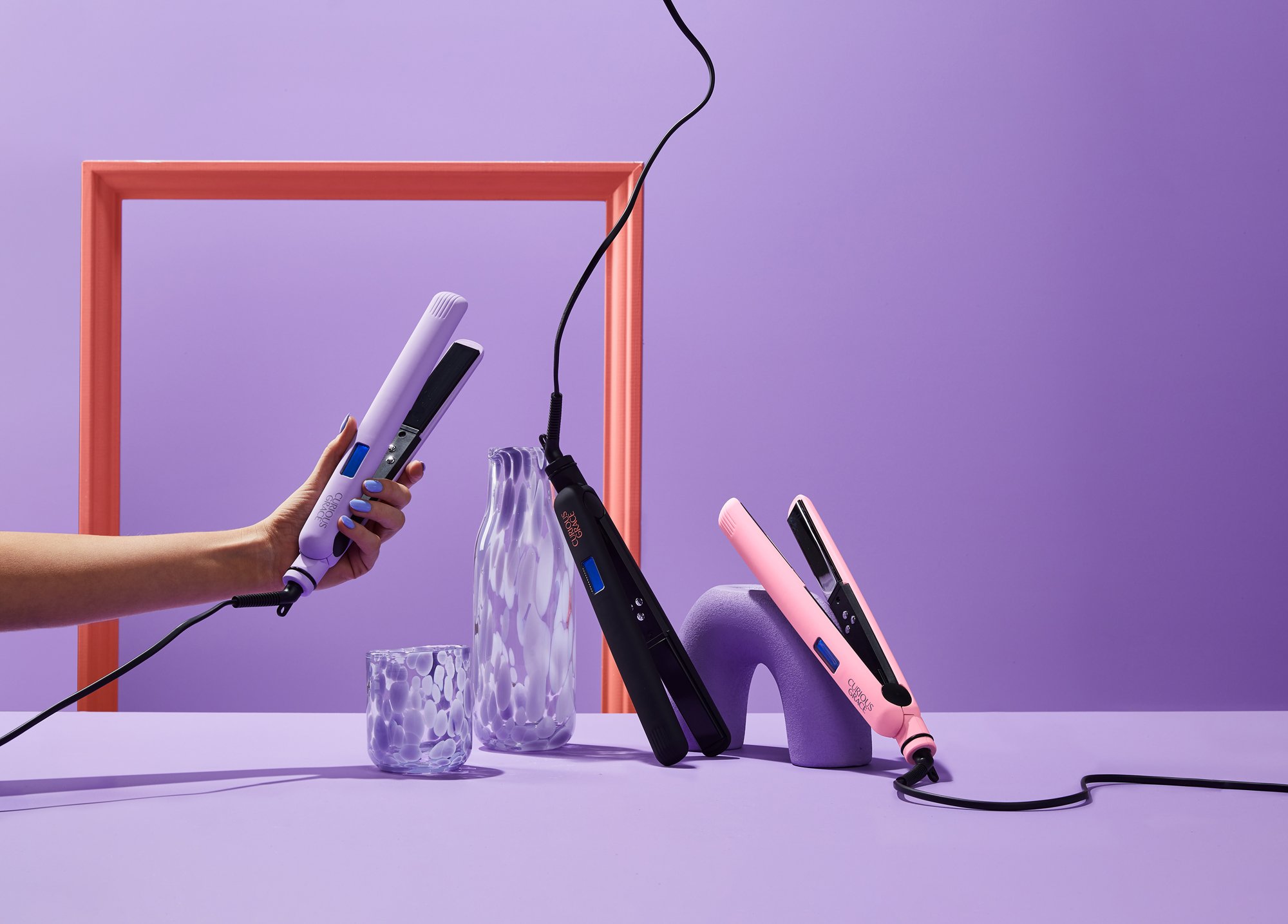
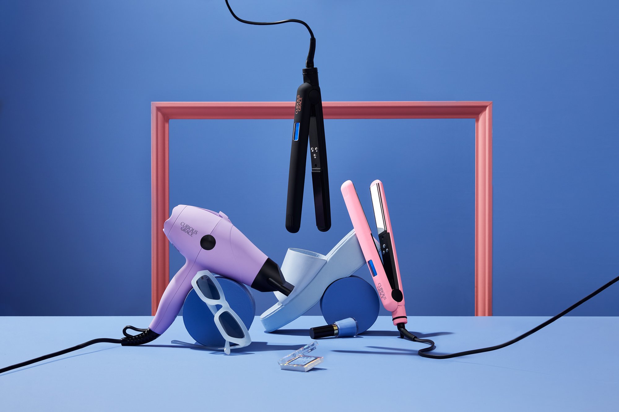
The “neon salmon” pink, the revered brand colour, was used in the colour of the frame throughout all the shots in the “still life” mood, while the cornflower blue, lilac and pink sets juxtaposed against the product which are posed in whimsical ways.
The images were used across multiple channels of VM/print and digital/social for the initial relaunch campaign before the talent shoot was approved to proceed.
